

Congratulations!
Spring 2020 Graduates
Parsons School of Design
AAS Graphic Design
Rebrand: Harlem Train Schedule
Research
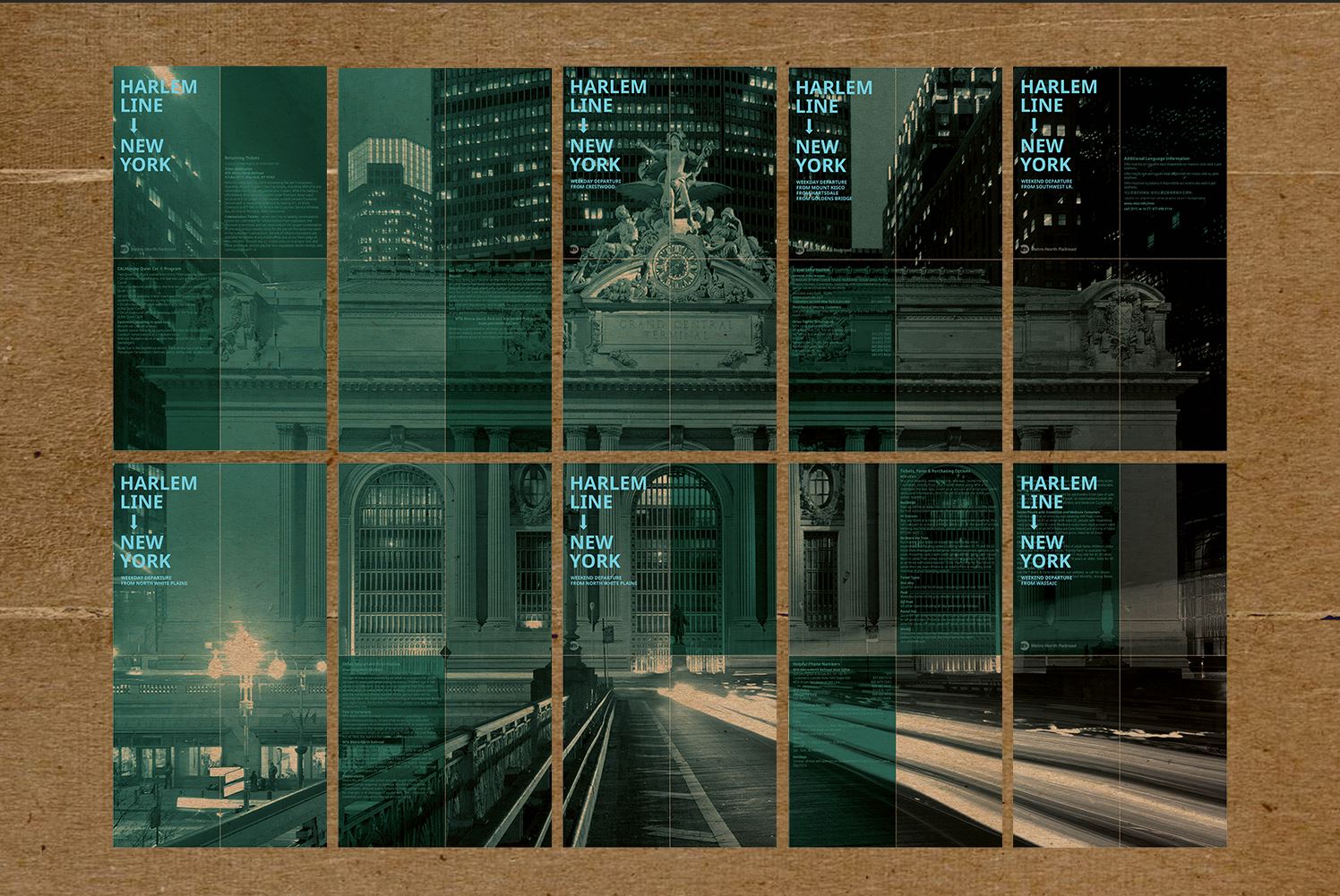
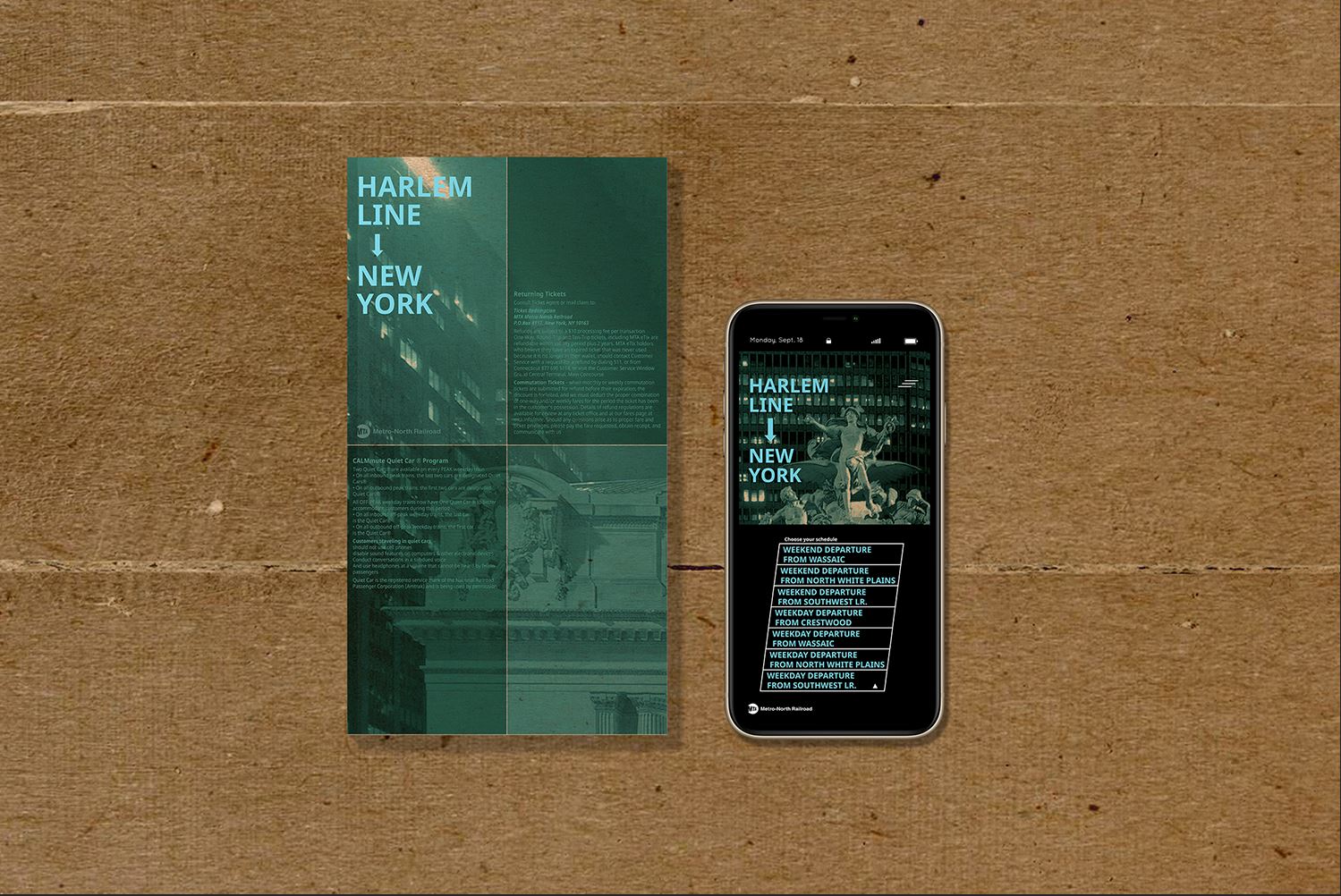
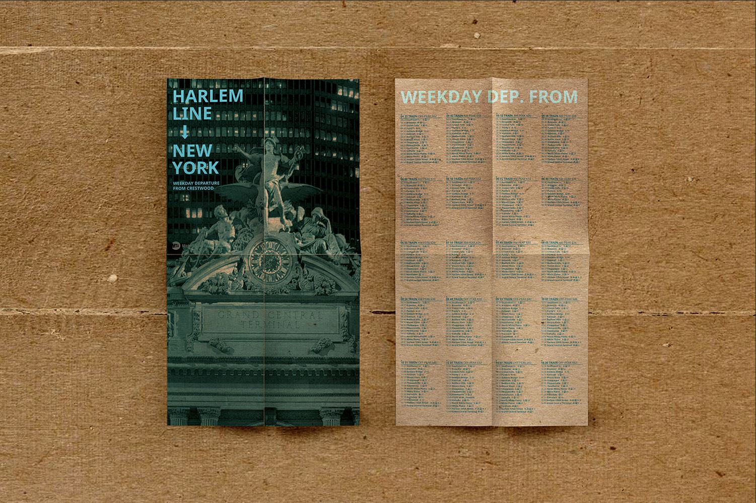
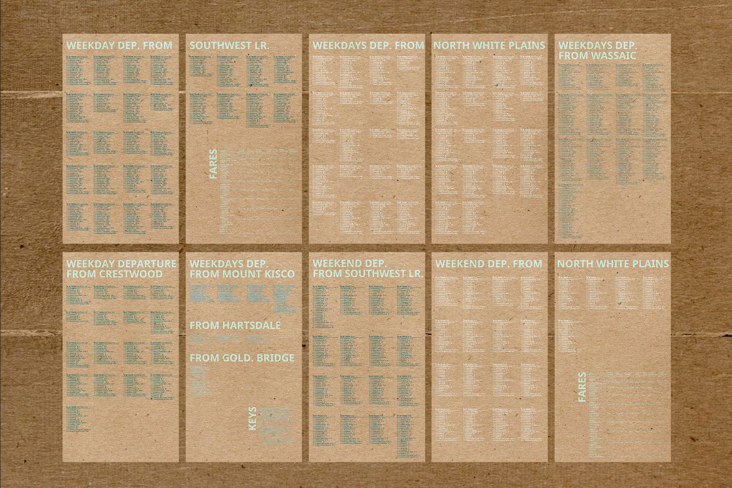
The objective of the project is to redesign the Harlem line train schedule. The original design, which is shown above, is harsh on the eyes and confusing for new passengers. I reorganized all the information and decided to separate the schedule from its various departure locations. The key information, such as the departure time and the peak, have been changed into military time and highlighted. The pamphlet can be opened as a poster or folded into a pocket-size 4x6 inches.
Front side
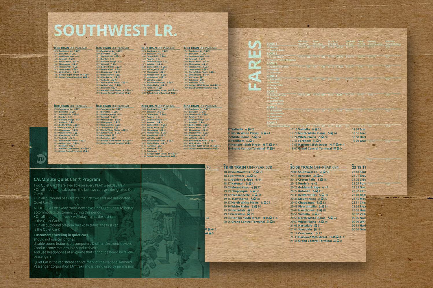
When the pamphlet is folded, the cover clearly indicates train direction, departure location, and whether it is the weekday or weekend schedule. A user only has to carry the schedule for the train they frequently take, instead of having extra information to confuse them. Cyan is the main color throughout the pamphlets, and it is also used to group schedules for the entire Harlem line. MTA guidelines and rules are found on the front panel, placed on top of a dark green box for emphasis. When the user collects all the pamphlets as a set and opens them as a poster, a beautiful photograph of the final station, Grand Central, will unfold.
Back side
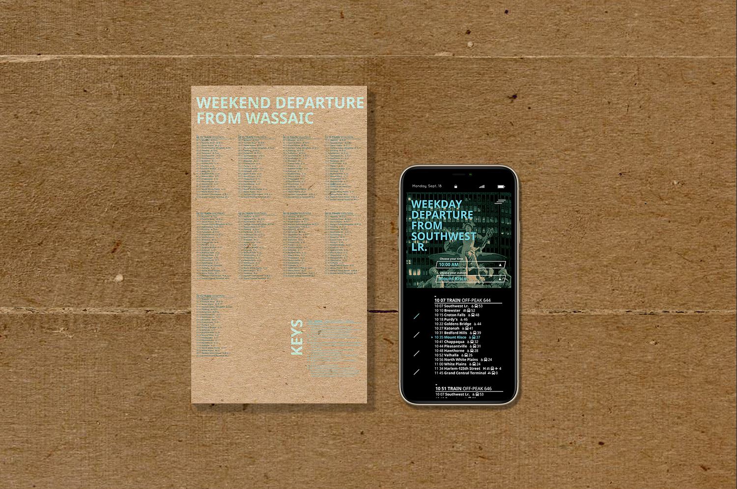
The back features time-related information. Each station is marked with keys, such as bus transfer and handicapped signs. The time tables are in different shades of cyan to color-differentiate each departure location.
Mobile App Version
Utilizing the same set of data and organization style, the app version serves as a contrast of the print version. Slanted lines are used as the uniting visual feature. The information layout is enhanced with an extra layer of thoughtful UX UI design.