

Congratulations!
20/21 Graduates
Parsons School of Design
AAS Communication Design
Breeze Electric Scooters
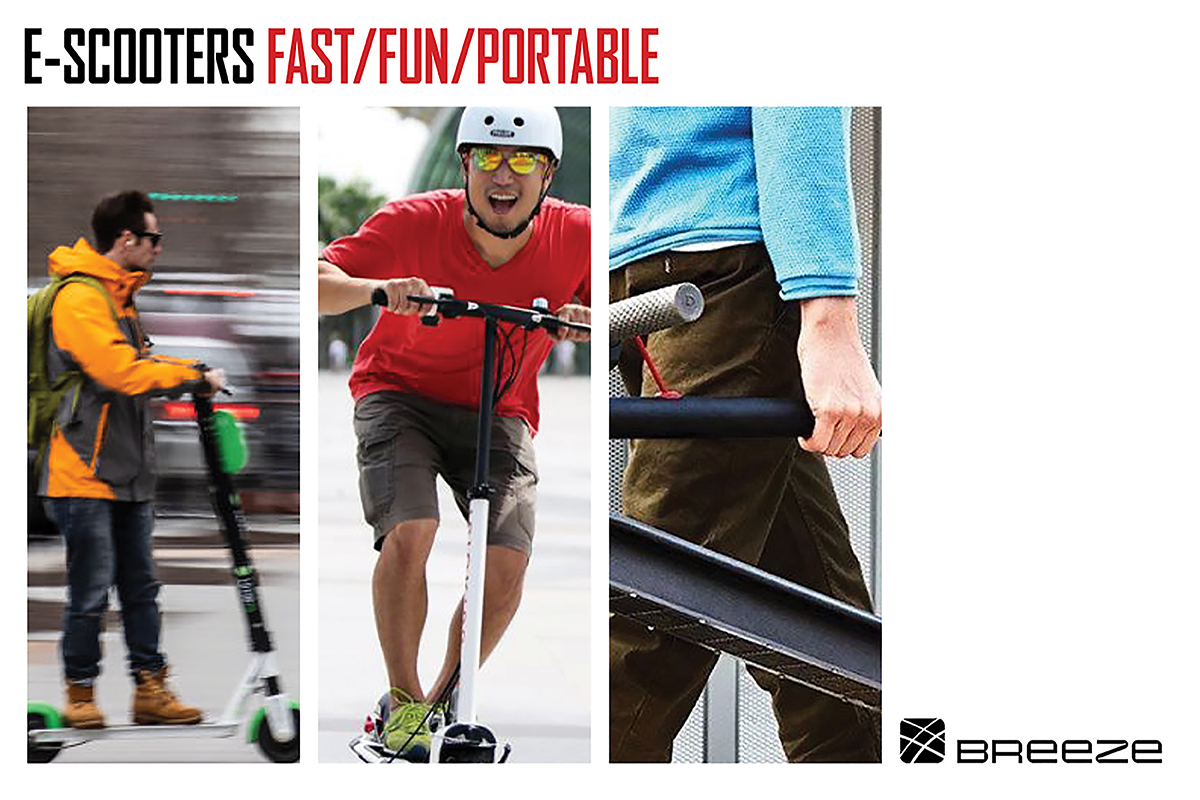

Breeze Electric Scooters is a fictitious company that is riding the wave of micro-mobility and electric transportation. For this Brand Experience project, I created the image and word marks to define the brand as a Fast, Fun and Portable alternative to current transportation methods. My brand statement is as follows: "Breeze is committed to the manufacture and sale of sustainable electric scooters that will help reduce the need for gas-powered vehicles on our roadways. We believe that every electric scooter we sell will help transform today's gridlock into tomorrow's open road. Go Forward with Breeze."
The typeface chosen for the word mark is Changling Neo Regular. The geometric counters and squared edges provide an industrial quality to the mark. This font is unicase (the upper- and lower-case letters are interchangeable) allowing for a variety of combinations. The look is bold and modern to match the Breeze brand. The supporting typefaces complement the word mark. Basic Gothic Pro Extra Light and Bold are used for the text and Agency Extended and Condensed are used for callouts and headings.
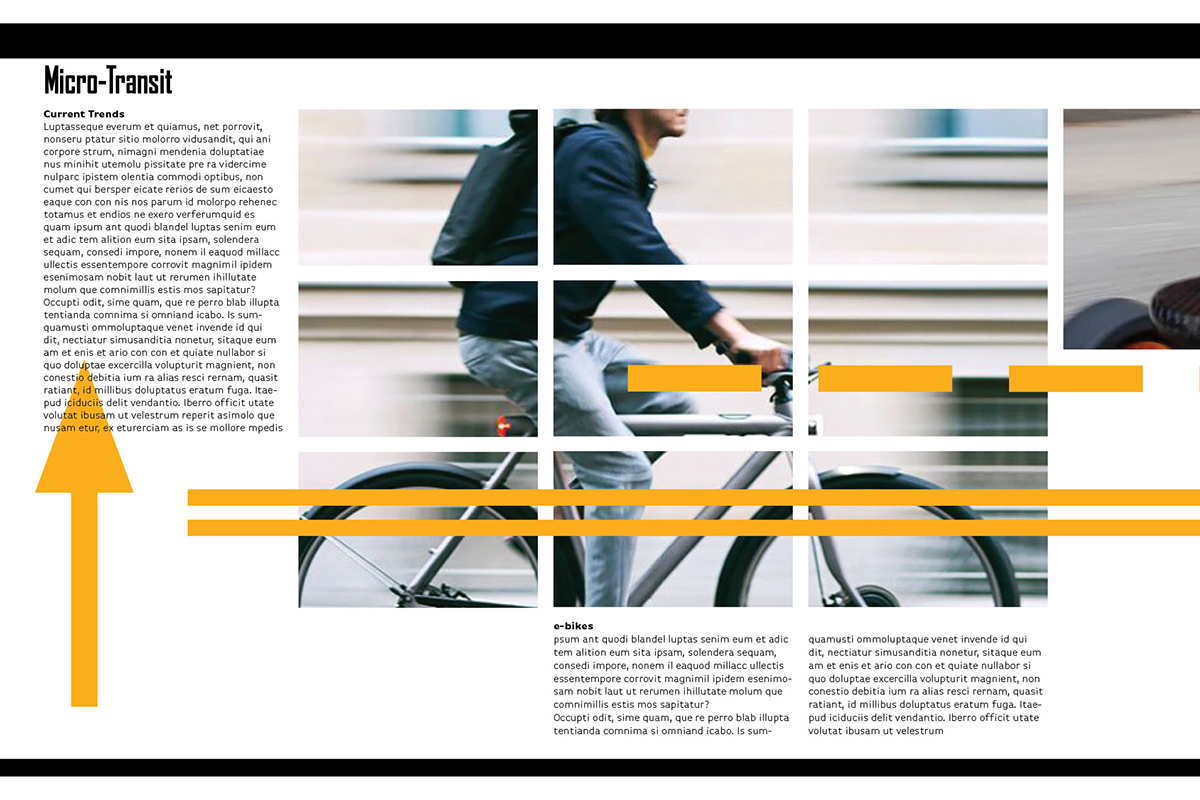
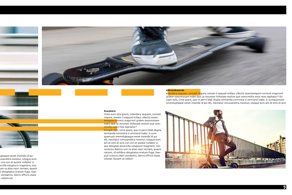
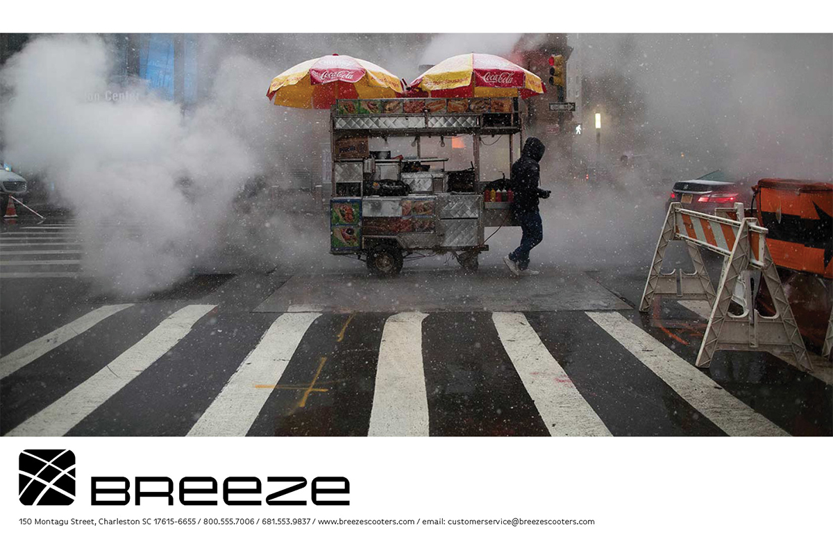
The colors and graphics reflect the signs and colors of city roadways, presenting a modern, bold and urban image appealing to a young, urban audience. The imagery for the brand includes photos of cities and suburban streets with cars, pedestrians and people riding a Breeze showcasing the benefits of Breeze Scooters - Fast, Fun and Portable.